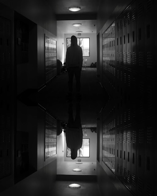
This week I was tasked to design portraits of my fellow advanced photo folks. We were to look for the interesting backgrounds, then design these portraits. I made this photo series in black and white to make it more cohesive, but the effect also makes my photos appear more organic, yet meaningful and intentional. Although these photos are very staged and designed, I wanted them to look like stolen moments as well, ~almost~ candid. See this captured the best in "Ben in the studio." These photos also have a common theme of pretty great color contrast. Again in "Ben in the studio," there's the stark contrast between the darker objects on the bottom half of the frame and his white shirt and the white walls. I got lucky because both shooting days, David and Ben both wore white shirts, so they looked really good in photos together and really good on camera in general. In these portraits, the background calls attention to the subject of the photo; I made sure that the subject isn't a part of the background because these are portraits after all. I've also captured the subjects' relationship with another object in the shot; this is clearly seen in "Vulnerable Ben and his camera" and "
Boy in white shirt hands another boy in white shirt a white tissue."
 |
| The sky is the limit, Ben. |
 |
| Ben at rest |
 |
| Balanced David |
 |
| Ben shooting me |
 |
| Vulnerable Ben and his camera |
 |
| David and Ben reflecting |
 |
| Ben in the studio |
 |
| Foliage mimicking Ben's energy |
 |
| Ben posing with strategically placed foliage |
 |
| Boy in white shirt hands another boy in white shirt a white tissue |


Comments
Post a Comment